Creating the Perfect Colour Scheme for Your Home
If there’s one thing we at Three Wise Monkeys Interiors believe in, it’s that life’s too short for beige walls. Colour isn’t just decoration — it’s emotion, energy and identity, all wrapped up in a fabulous tin of paint. Whether you’re a bold maximalist with a penchant for pattern, or you simply want your home to feel a bit more “you”, choosing the right colour scheme is the secret sauce.
Let’s dive into the art and science of creating a colour palette that makes your heart sing — and your rooms sparkle.
The Psychology of Colour: How Hues Affect Your Mood
Colour isn’t just a visual choice — it’s psychological. The shades you choose can completely transform how a room feels and how you feel in it.
Blue evokes calm and clarity — think spa bathrooms or restful bedrooms. Just don’t overdo it, or you risk drifting into “corporate boardroom chic.”
Green brings balance and freshness, perfect for kitchens and living spaces that need a touch of nature without the muddy footprints.
Yellow radiates optimism and creativity — ideal for dark hallways or small kitchens that need a lift.
Red is dramatic, passionate and best used in doses (unless you want your dining room to feel like a tapas bar in Madrid — which, to be fair, might be perfect).
Pink has evolved far beyond the nursery. From blush to fuchsia, it can feel sophisticated, modern and full of life.
Black or charcoal adds depth, grounding even the most chaotic mix of colours.
The key? Mix tones that complement each other and align with the mood you want in each room. Your home should make you smile every single day.
Deep orange is striking, warming but grounded
North vs South-Facing Rooms: Lighting Matters (A Lot)
Light changes everything. The same paint can look completely different depending on whether your room faces north or south — and if you’ve ever painted a “soft grey” that turned purple overnight, you’ll know exactly what we mean.
North-facing rooms get cooler, bluer light. To balance this, warm tones like terracotta, ochre, or creamy neutrals can create a cosier feel.
South-facing rooms are bathed in golden sunlight, so you can go moodier and darker without fear of it feeling like a cave. Jewel tones, deep greens or navy blues work beautifully here.
East-facing rooms get bright morning light but cooler afternoons — perfect for refreshing blues or greens.
West-facing rooms glow in the evening — great for rich, warm colours that come alive as the sun sets (and the wine opens).
Always, always test paint swatches on multiple walls and check them at different times of day. Your colour scheme should look just as good at 8 a.m. as it does at 8 p.m.
Terracotta brings warmth and sophistication to this north-facing room
The 60-30-10 Rule: The Designer’s Secret Weapon
If you’ve ever wondered how interior designers make even the boldest rooms feel cohesive, here’s the trick: the 60-30-10 rule.
60% is your main colour — the one that sets the tone (usually your walls or largest furniture pieces).
30% is your secondary colour — the supporting act (think sofas, curtains, or rugs).
10% is your accent — the little pops that add character (cushions, artwork, lamps, maybe even your toenail polish if you’re committed).
For example, a teal living room might use mustard as a secondary tone and coral accents to add playfulness. The ratios keep things balanced, even when you’re playing with big, confident colour. Think of it as organised chaos — the Three Wise Monkeys way!
But also remember to throw in a “disruptor” colour, e.g. acid yellow candle sticks, a scarlet rug or a cobalt blue vase. This pop of a disruptor colour should almost feel out of place. It’s something unexpected and stops a scheme looking too organised and “tasteful”. Keep it playful!
60% sage green + 30% pink/ mauve + 10% yellow/ mustard
Building a Scheme from Artwork, Fabric, or Wallpaper
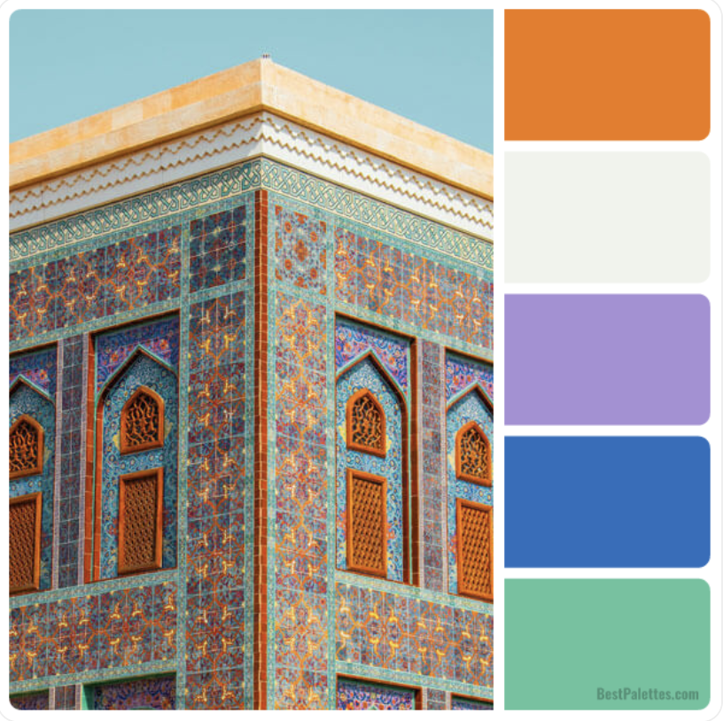
Not sure where to start? Pick one thing you absolutely adore — a piece of art, a patterned cushion, or a wallpaper that makes your pulse quicken — and build from there.
Pull your palette. Choose two or three colours from your inspiration piece that you love most. Don’t match everything exactly; instead, find tones that complement them.
Balance boldness. If your wallpaper is wild, keep the other large surfaces calmer — but don’t be afraid of contrast. A vibrant painting can look sensational against a deep, moody wall.
Play with texture. Metallics, velvets, rattan and gloss paint can all alter how colour feels in a space. Maximalist design is as much about layering texture as it is colour.
Finish with flair. Once your base colours are set, bring in personality through accessories, lighting and plants (because every room looks better with something leafy).
This approach guarantees your scheme feels intentional — not like a lucky dip at the paint counter.
Final Thoughts: Be Brave, But Be You
Designing with colour isn’t about following trends — it’s about curating joy. Don’t worry about what the neighbours think (unless they’re asking for your decorator’s number). Start with what makes you smile, trust your instincts, and remember that your home is your canvas.
And if you’re feeling stuck — or just want a bit of help wrangling your rainbow — that’s where I come in. At Three Wise Monkeys Interiors, I help homeowners across Bristol and beyond create vibrant, characterful spaces that tell their story. Follow along on Instagram @threewisemonkeysinteriors for daily inspiration, colour tips, and a healthy dose of interior mischief.
Because beige walls are fine… for other people.


